holistic brand + experience design
From identity design to UI educational tools
What began as a rebrand for Adagio’s 20th anniversary evolved into a long-term collaboration across digital, print, and event design.
The work spans logo design, website, social media, event design, promotional items, and a UX strategy tailored to the camp’s users — aligning brand coherence with operational needs through custom-designed music education tools.

Logo
To mark Adagio’s 20th anniversary, the camp needed a refreshed identity — one that could celebrate its legacy while feeling vibrant, current, and familiar to returning families. The new logo had to stay playful without feeling juvenile, and modern without losing warmth. Here’s where the thinking began.
Brief
Continuous
The rebranding must stay familiar and honor the camp’s legacy
Colorful
Celebrating 20 years of success should be festive and vibrant
Modern
It’s important to keep up with the times
Previous Logo
The original logo had charm and boldness. Its geometric shapes and saturated colors gave it an immediate presence — playful, recognizable, and easy to reproduce.
The structure was strong, and its compact rhythm captured the energy of the camp. The repetition of circular shapes echoed not only visual motifs familiar in music notation, but also conveyed a sense of motion and continuity.
New Logo
The color palette became more flexible — allowing the identity to adapt across print, digital, and educational contexts without losing its warmth or clarity.
The redesign kept the original structure but softened its edges, adjusted proportions, and refined the spacing to create a more balanced visual rhythm.
Logo Mark
A reduced logo mark was designed as a symbolic shorthand for use in tight spaces, while still carrying the visual identity forward.
Rendered as a vinyl, it holds just enough musical reference to stand on its own.

Website
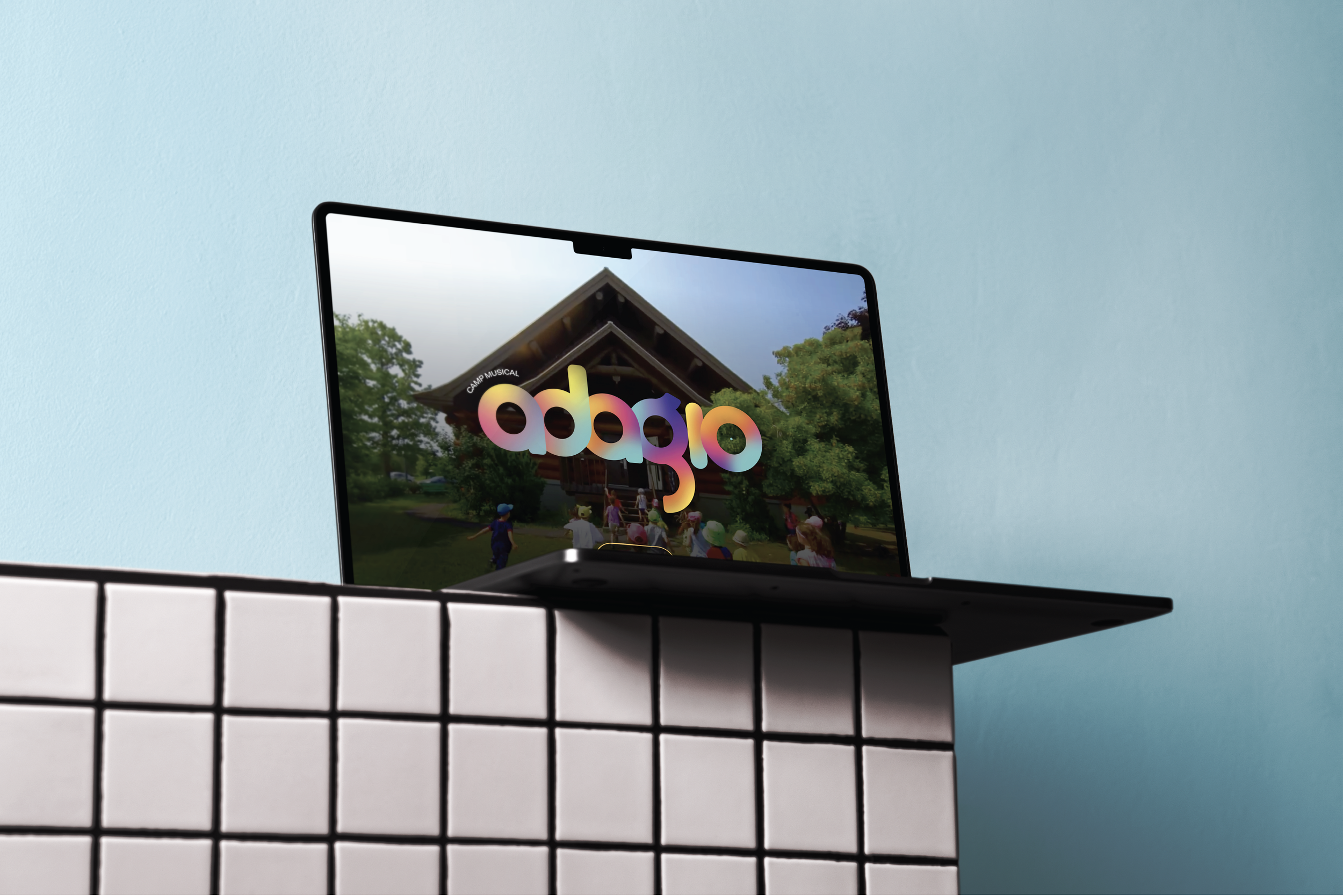
Following the rebrand, the website became the next key touchpoint to update — a space where the new identity could come to life. The challenge was to translate the camp’s energy and warmth into a clearer, more structured digital experience, while keeping things light, welcoming, and easy to navigate for both new parents and returning families.
Responsive Design
The site was designed to adapt seamlessly across devices, with a layout that remains legible, light, and intuitive. Visual hierarchy, touch targets, and content density were adjusted to support fluid navigation and consistent brand presence at every scale.
Social Media
Managing the camp’s online voice across platforms, with a focus on clarity, consistency, and community.


