rebrand
Friends & Family is a music management company rooted in collaboration, trust, simplicity, and friendship. The project centered on reimagining the brand’s visual system and creating a strong, timeless logo that embodies its core values and supports future growth.

Previous Logo
The original logo emphasized clarity and structure, using a bold monogram to reflect unity, connection, and a sense of permanence :
Collaboration
Working together to create music that connects and inspires, like a true family.
Trust
Building genuine relationships with artists, always staying honest and reliable.
Simplicity
Making music and connections easy to understand and accessible to all.
Friendship
Fostering a warm, welcoming environment where everyone feels like they belong.
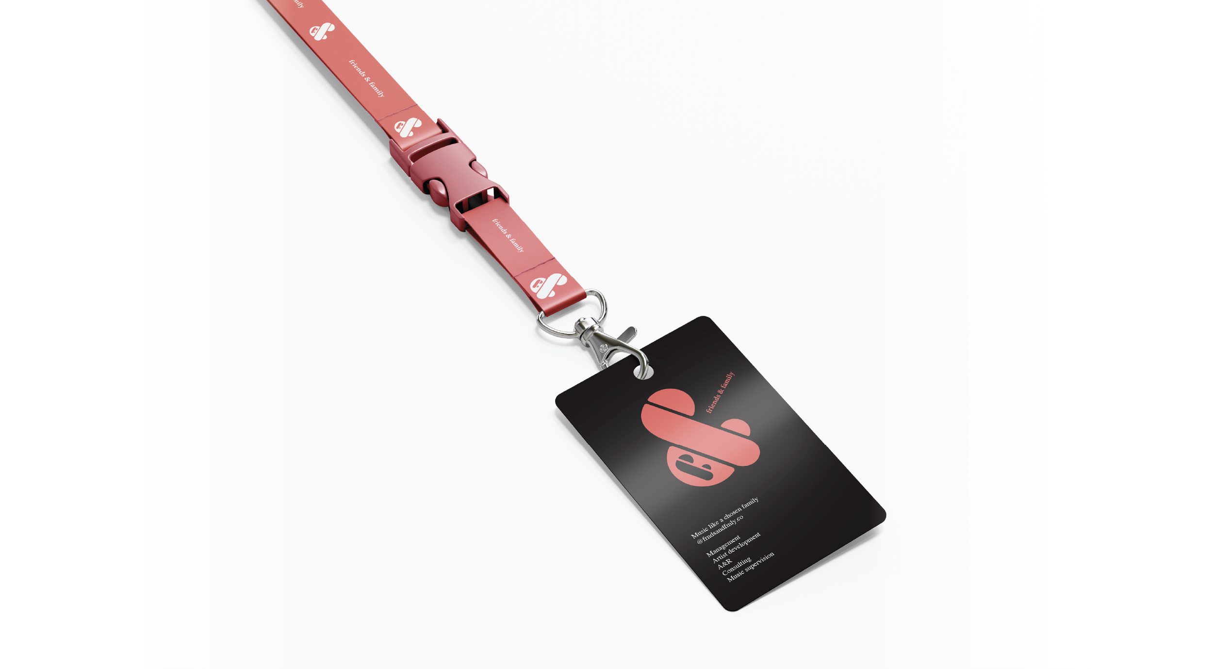
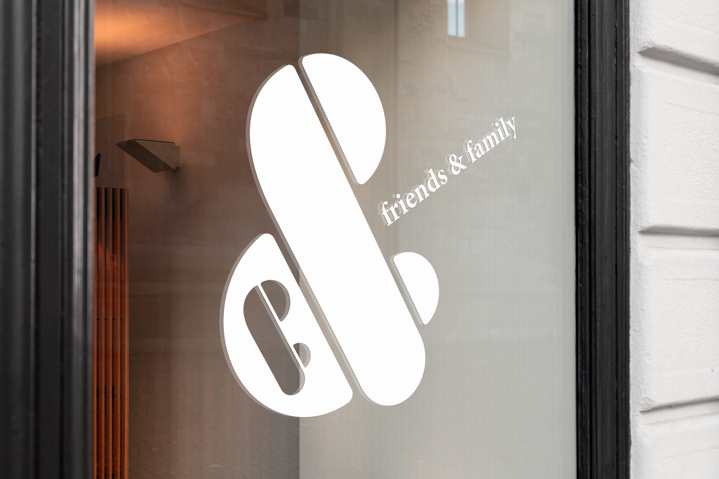
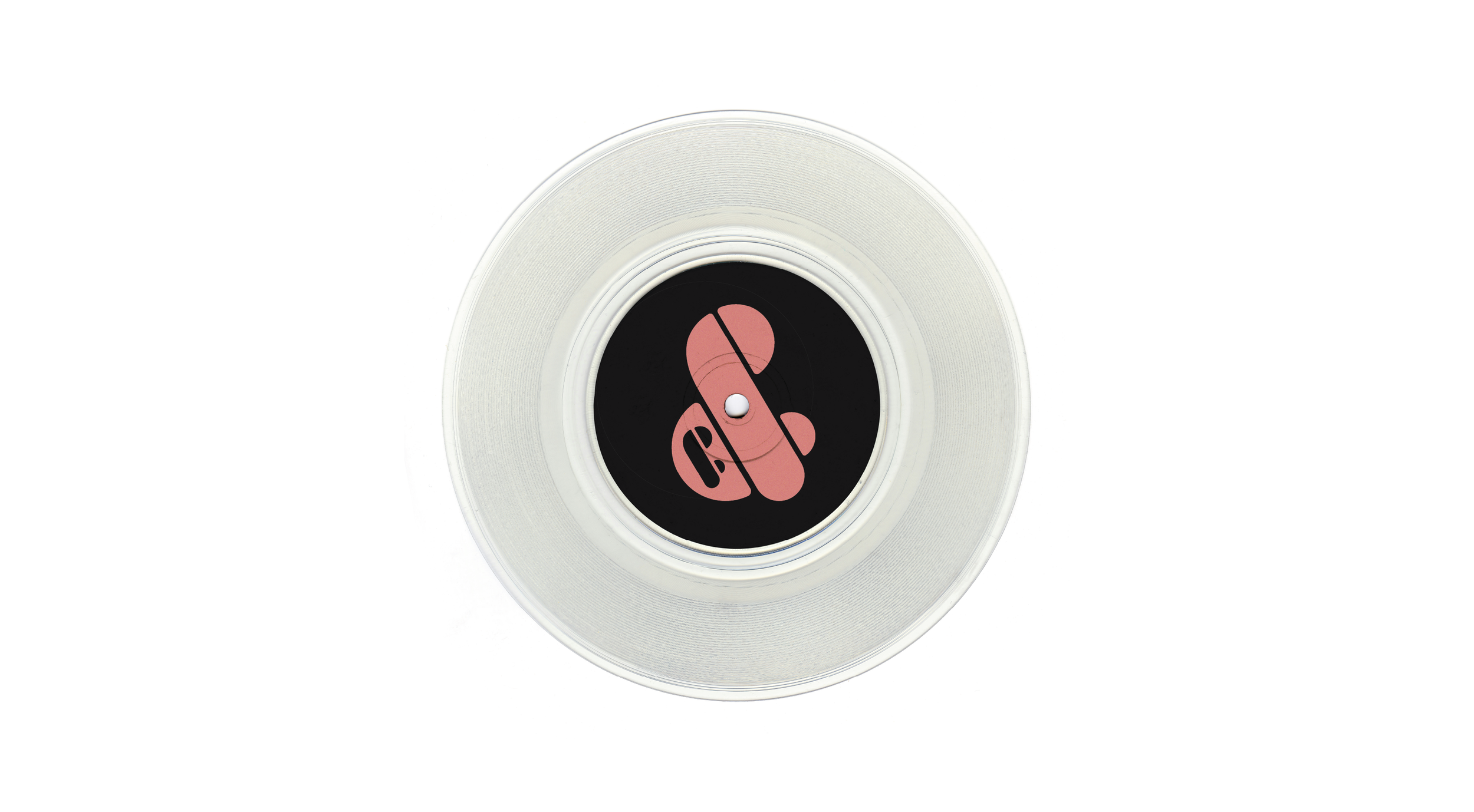
New Logo


This logomark merges the two Fs into a single, considered form. In contrast to the previous version, the ampersand is no longer placed between them but integrated into the structure. This approach makes the idea of collaboration part of the form itself. The geometry draws from the visual language of record labels, where clarity, recognition, and adaptability matter.